Learn
Motif widget gallery
Recognise common Motif controls, try them in a working program, and choose widgets for your own interface.
A widget supplies behaviour as well as appearance: a push button handles keyboard activation, a text field manages editing, and a list tracks selection. Start with the first Motif program if creating widgets and connecting callbacks are new to you.
Try the gallery
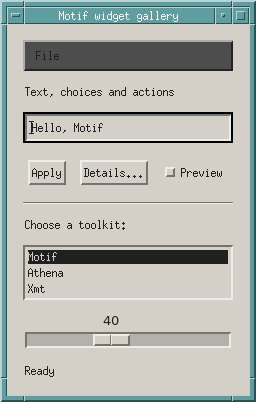
The complete gallery source is a small interactive program. Type into the text field and press Apply, select a toolkit from the list, toggle Preview, or move the scale. The status label reports the result. Details… opens an information dialog; File → Quit exits.
Save the source as widget-gallery.c. With Motif development files installed:
cc -std=c99 -Wall -Wextra -o widget-gallery widget-gallery.c -lXm -lXt -lX11
./widget-gallery
Which widget should I use?
| Need | Widget | What to look for |
|---|---|---|
| Display a caption or status | XmLabel | Presents text or a pixmap; it is not an editable field. |
| Perform an action | XmPushButton | Use XmNactivateCallback for mouse and keyboard activation. |
| Store an on/off choice | XmToggleButton | Read the new state in XmNvalueChangedCallback. |
| Enter one line of text | XmTextField | Editing, selection and cursor movement are built in. |
| Edit several lines | XmText | Use a scrolled text widget for longer documents. |
| Select existing items | XmList | Choose a single, browse, multiple or extended selection policy. |
| Adjust a bounded number | XmScale | A slider with minimum, maximum and optional displayed value. |
| Separate groups visually | XmSeparator | A divider, not an interactive control. |
| Open a submenu | XmCascadeButton | Connect it to a menu pane with XmNsubMenuId. |
| Present a standard message | XmMessageBox | Convenience functions create information, warning and question dialogs. |
The screenshot demonstrates most of these in one window. XmText is the
multiline alternative to the text field shown here. A toggle used in a radio
box provides a mutually exclusive choice; a standalone toggle represents an
independent setting. The gallery’s Preview control demonstrates the latter
and reports its state; it does not render a separate preview.
Connect actions to application code
The Apply button reads the text field and updates the status label. The string returned by this getter belongs to the caller:
char *text = XmTextFieldGetString(entry);
/* Use text here. */
XtFree(text);
In contrast, a list callback’s item belongs to the callback data; do not free
that XmString. The gallery converts it to a separate character string, copies
that text into the field, then frees the converted string. Check ownership for
each API instead of assuming all getters behave alike.
For a toggle, the callback provides the new state:
static void toggle(Widget w, XtPointer client, XtPointer call)
{
    XmToggleButtonCallbackStruct *state = call;
    (void)w;
    (void)client;
    set_label(status, state->set ? "Preview enabled" : "Preview disabled");
}
Here set_label is the helper in the downloadable program. It creates an
XmString, sets XmNlabelString, and frees the temporary string after the label
has copied it. The snippets illustrate parts of the complete program, rather
than separate compilable programs.
Containers determine layout
The outer XmRowColumn stacks the gallery’s controls vertically. Another
RowColumn places the action buttons horizontally. The scrolled-list convenience
function supplies a ScrolledWindow parent for the list.
| Container | Typical use |
|---|---|
XmRowColumn | Rows, columns, radio boxes and specialised menu arrangements. |
XmForm | Attach controls to edges, positions or other controls. |
XmPanedWindow | Let users resize panes with draggable sashes. |
XmScrolledWindow | Display a work area through a smaller viewport. |
XmFrame | Draw a border around a child or group. |
XmMainWindow | Organise an application around a menu bar, work area and related regions. |
Try resizing the gallery. Container rules, child preferences and resource values negotiate the result; assigning fixed pixel positions to every control would bypass much of the toolkit’s layout machinery.
Menus and dialogs are widget hierarchies
XmCreateMenuBar and XmCreatePulldownMenu construct specialised RowColumns.
The File cascade points at its pulldown, which contains a Quit push
button. Register the callback on the menu item that performs the action.
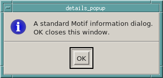
XmCreateInformationDialog returns the MessageBox inside a DialogShell. Managing
the MessageBox shows the dialog; its default auto-unmanage behaviour hides it
when OK is activated. The gallery creates the dialog once and reuses it.
It demonstrates a modeless message; modality is a separate design choice.
For filenames, use a FileSelectionBox or its dialog convenience function rather
than recreating a file chooser from a generic message dialog.
Keyboard use and gadgets
Try Tab and Shift+Tab to move through tab groups, arrow keys within groups, and Space on a focused button or toggle. Test an interface without a mouse while building it; callbacks for semantic actions help preserve keyboard behaviour.
Motif also supplies gadgets, such as XmPushButtonGadget. They participate
in a manager’s layout and input handling without owning individual X windows.
They are useful lightweight controls, but code that assumes every object has
its own Window must distinguish gadgets from widgets. This gallery uses
widget variants to keep the example straightforward.
Continue exploring
Change labels, spacing and colours in the X resources guide.
For detailed resource and callback tables, consult the XmLabel, XmPushButton,
XmToggleButton, XmTextField, XmList, XmScale, XmRowColumn and
XmMessageBox manual pages supplied with your Motif source or installation.
The Motif reference books provide a broader catalogue;
the Motif source tree
contains the manuals used when checking this example.